
New Kingston Mobile App Case Study

Description
New Kingston is a mobile app to sell merchandise for the reggae band, New Kingston.
my role
Google Certificate UX Design Student Responsibilities: brainstorming, wire framing, mockups, prototyping, design, and UX research.
project goal:
Design an engaging online shopping app that allows users to try on items and reduce the rate of returns. Implement a virtual fitting room and a clear return policy page in order to increase sales and reduce the number of returns/simplify the return process.
Duration:
February-April 2023

Research
Research study:
I conducted three moderated and two unmoderated low fidelity usability studies. My key performance indicators included time on task, use of navigation vs. search, user error rates, drop-off rates, conversion rates. I assumed users would have trouble with the search feature because it’s not yet fully functional. That was confirmed with the research. I did learn that beyond the search function users need more cues or options for navigation.


“[The virtual fitting room] was cool. I’m guessing I’m supposed to see myself with the camera. The process seems simple. I like that it’s there as soon as you click an item.”

digital wireframes:
My goal here was to create a virtual fitting room where customers could add multiple items to try on. They can switch between items. The bottom navigation bar is something I wanted to include on almost every page for quick access to key features.

PAPER wireframes:
I wanted to create a captivating, but sensible layout–one that included bold images, clear navigation menus, and a unique navigation bar at the bottom for most practical menu items.

digital wireframes:
The goal here was to help customers complete successful purchases of their favorite items at any time and to ensure intentional transparency of the return process.

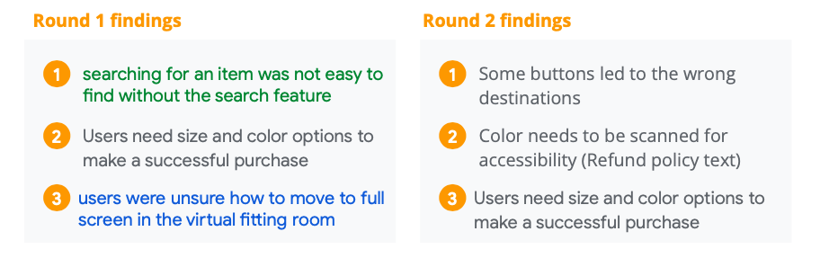
Usability Study
findings
The usability study tested a Virtual Fitting Room, Tracking Feature, and Customer Reviews. We tested the usability and effectiveness of these features in increasing customer satisfaction. We’d like to evaluate the ease of using the app and the success rate of completing the purchase journey. The main research question asked what frustrations users experience moving through the app.
Going forward
takeaways
Impact:
Users were pleased to see a virtual fitting room option. One user commented on the benefit of having a clear return policy. "Pretty straightforward. Most websites you have to search through to find their return policy. It was really easy to locate. Very visible."
What I learned:
I learned that users need more cues and options to find what they are looking for. They also appreciate very clear navigation features.


Accessibility Considerations
One user mentioned feeling colorblind when looking at the text leading to the return policy page. I need to check the colors for accessibility.
The font size may be larger than usual because of my own disability. I need to make the font smaller to fit the average font size for web/apps and allow users to adjust text size on their own.
Adding a functional search feature is something to consider.